
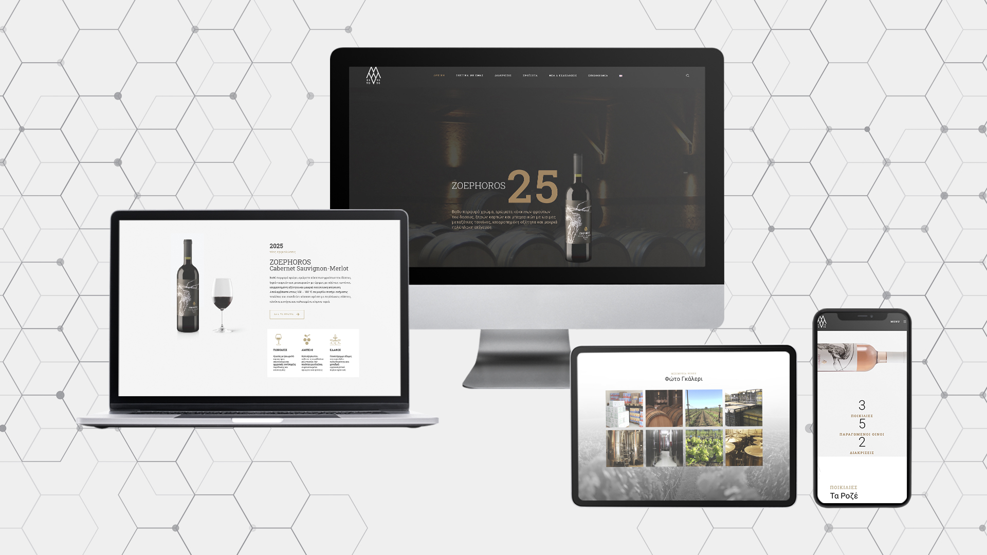
In an era where users browse the internet from all kinds of devices—from smartphones and tablets to laptops and smart TVs—having a website that quickly and beautifully adapts to every screen is essential.
A website’s adaptability across screen sizes isn’t just about user experience; it plays a crucial role in SEO as well.
If you’re interested in more practical tips to boost your website’s SEO, you can read our detailed article here.
Today, we’ll focus on practices related to responsive design.
What Is Responsive Design?
Responsive design is the technique of designing a website so that its content, images, and layout automatically adjust to every screen size—from a small mobile device to a wide desktop display.
Why Is It Important for SEO?
Since 2015, Google has made it clear that mobile-friendliness is a significant ranking factor.
With the adoption of Mobile-First Indexing, Google now evaluates the mobile version of a site first to determine its ranking in search results. Therefore, if your website isn’t responsive, you’re likely to lose valuable ranking positions.
How Exactly Does Responsive Design Help SEO?
When a site adapts to every screen size, it improves the loading speed of all its elements. Speed is a key ranking factor, with the ideal loading time being under 2 seconds.
When content loads and adjusts correctly to the screen, users are more likely to stay longer and not bounce away immediately (lower bounce rate).
And perhaps the most important benefit: it creates a pleasant and user-friendly experience—one of Google’s top criteria when evaluating a website’s quality.
Practical Tips to Instantly Improve Your Website’s Responsiveness:
- Use media queries to adjust the layout to different screen sizes.
- Optimize your images so they load quickly on all devices.
- Use adequate button and font sizes for touchscreens.
- Adapt your navigation menu (hamburger or slide-in) for easy use on mobile.
- Check how your website appears across different browsers and devices to ensure functionality.
Responsive design is much more than just a “stylish” technique. It’s a strategic investment that ensures your business is visible, user-friendly, and effective across all devices and platforms.
Want a responsive site that delivers results?
At Pylarinos Advertising, we combine technical excellence with strategic SEO to ensure your site is not only beautiful but also ranks high in search engines. Take the next step by contacting us here.