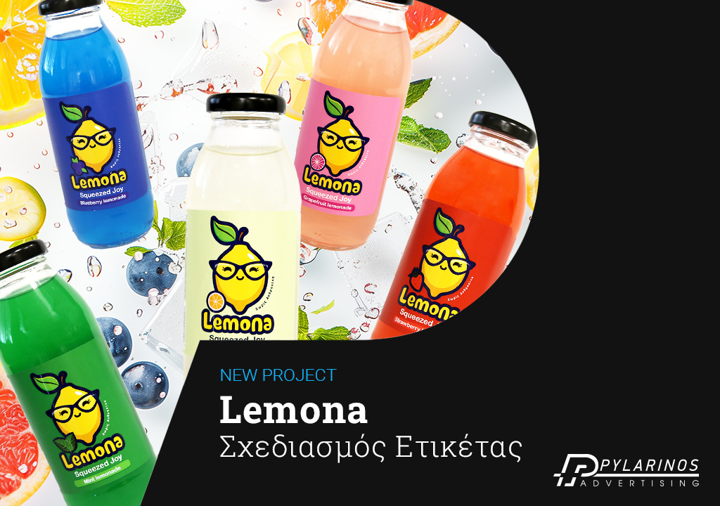
When the Lemona team entrusted us with creating the label for their new line of Lemona soft drinks, we knew this wasn’t just a typical design challenge. Lemona isn’t just another lemonade—it’s a lifestyle. And our mission was to capture that freshness, youthful energy, and rebellious spirit on a label that speaks even before the bottle is opened.
Our goal was for the label to catch the eye on the shelf, be insta-ready, and at the same time radiate authenticity and naturalness.
Each Lemona flavor was given its own visual “personality”—from the classic Original to the fruity Strawberry and the refreshing Mint. The colors, graphics, and typography were carefully selected to create a vibrant, playful, and instantly recognizable look.
Strategic Design Aimed at Product Success
The Lemona label was designed with the following in mind:
- Clearly highlighting the flavor through color and illustration codes.
- Standing out on the shelf with a bold layout and modern aesthetic.
- Compatibility with printing and packaging standards to ensure a flawless production result.
The result?
A product that’s unforgettable.
A big thank you to the Lemona team for their trust.
View the project here.


